Cafe Cat

May 2022 - August 2022

Lead Game Designer & Programmer

Project Overview

Developer Info

Role: Lead Game Designer & Programmer

Tools Used: Unity, Excel Spreadsheets, Plastic SCM, Clip Studio Paint, Adobe Premier Pro, Dev2Dev

Team Size: 8+

Company: MassDigi

Duration: 4 Months

Game Info

Genre: Time-Managment Strategy Game

Platform: IOS & Android

Project Status: Released August 4th, 2022

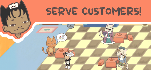
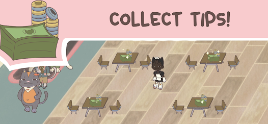
Game Description: After cats have inevitably taken over the world, you are forced to run a cafe for cats! Try your best to keep up with the cat-o-strophic chaos as you manage orders, take tips, and grow your cafe! :3

Contributions

  • Spearheaded the brainstorming process to allow our team to effectively work through hundreds of ideas while still including everyone.
  • Developed and designed the customer personality types and stats to add variation to gameplay
  • Created and implemented the entire difficulty system while still making it easily customizable allowing for day-to-day changes in the cafe to editable entirely from a CSV file.
  • Designed the in-game shop layout so that the user interface had a readable layout
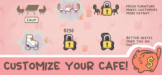
  • Designed and implemented upgrades to reward and entice players while running the cafe.
  • Integrated data collection and analytics using DevToDev SDK

What I Learned

  • Pre-Production is critical to creating a well-designed game that will be able to be released on time.
  • The importance of getting playtesters from various different backgrounds and age ranges in order to ensure that the game is readable and understandable
  • It is important to trust your teammates and be willing to adapt to their ideas and personal working styles.
  • The value of analytics and how they can be used to further polish areas of design.

Pre-Production

Brainstorming

Our team during our time spent about a month in pre-production during our time at MassDigi so we spent a long time in the brainstorming and rapid prototyping stage. Analyzing over 1000 different ideas to try and find a game that would be fun and marketable while also simultaneously being possible to create within a 4 month time frame.

At the start it was hard to nail down an idea that really captivated us. Due to my past game jam brainstorming experience, I lead the team’s brainstorming process. Providing a step by step plan of action to generate a ton of ideas that could be filtered into concepts that deserve art and rapid prototyping.

The brainstorming plan involved:

  1. At first, any idea was valid and could be thrown in the brainstorming document anonymously.
  2. Once a big list was created, then any teammate could highlight an idea in red for any reason as a concept they did not want to work on. (That way our team is always happy with their work)
  3. Once the all ideas were filtered, then everyone on the team would be allowed to highlight 1 or 2 ideas they loved. (Can’t be an idea in red)
  4. These loved ideas would then be analogized and evaluated by the entire team to see if it was viable.

This is a process that I still use to this day as I find it to be the most effective way to generate valuable gameplay ideas.

Eventually, we honed in on 4 game ideas we found huge potential in:

  • A roguelike deck-building card game about a cat trying to take over the world.
  • A virtual pet simulator that involves rescuing and repairing stuffed animals.
  • A tower defense game that has the player building a pillow fortress.
  • A time management cafe simulation game where you serve impatient cat people.

Final Brainstorming Presentation Here

Rapid Prototyping

Once we had these 4 ideas finalized, the programmers started rapidly prototyping how these games may work while the artist drafted up concept art for each of the game ideas.

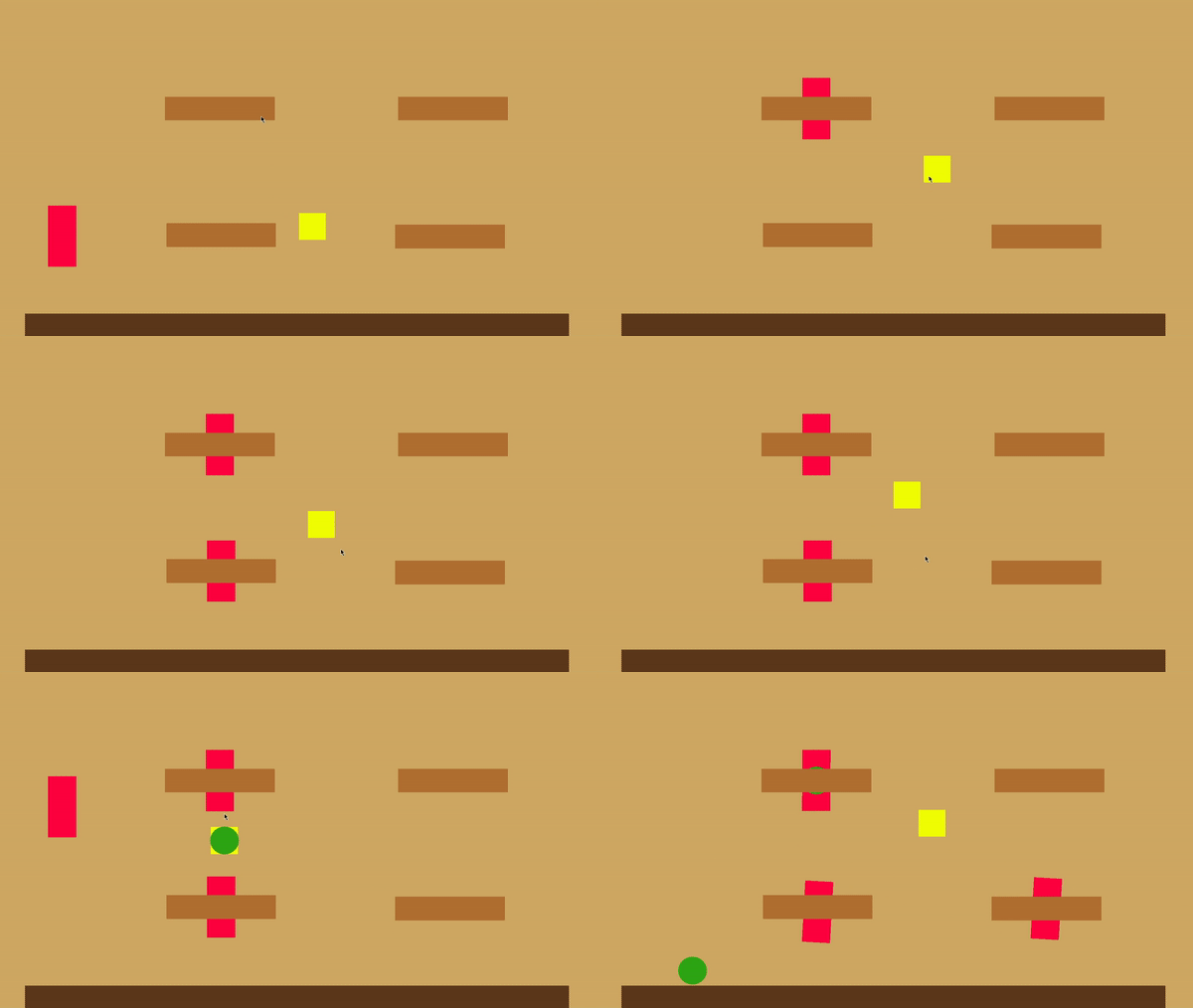
For most of our gameplay prototypes, we found little success. However, the one I created for the time management cafe simulator seemed to really captivate our coworkers in the studio. The prototype was very rudimentary and difficult because of the lack of visuals but that didn’t stop people from getting addicted with the core gameplay loop. Making most people we showed the prototype to desperately wanting to serve as many red rectangles as they can.

This played a huge role in our team’s final decision on what game to start full production on. We believe that our team following the fun made it easy for us to expand on the game as the months went on. Allowing us more time to polish the game before its release.

Design Pillars

Once the game was decided on, we wanted to break the game’s core design into it’s key components. The design pillars that we decided on were:

  • Charming
    • Style needed to be memorable and cute.
  • Management
    • Players need to feel like they were managing an actual cafe.
  • Progression
    • Players should feel like they were making progress each day.
  • Simple
    • Game needed to be easy to learn and play.
Concept Art for Cat Mind Control Card Game
Concept Art for Stuffed Animal Virtual Pet Game
Concept Art for Pillow Fort Tower Defense Game
Concept Art for Time Management Cafe Simulator Game
Cafe Cat Prototype
Design Pillars written on our team's whiteboard

Content Design

Lore

The game’s main lore is based off our design metaphor “Cats crave control!” which was a driving factor in two of our biggest ideas during the brainstorming phase.

We knew our game needed to be more than just cafe management game with cats. That’s why I tried utilizing our design metaphor to create a captivating story that would at least make the lore memorable. 

This culminated in main story becoming that cats had taken over the world and have now forced the player to serve cat-kind in a comical cat maid outfit. As wacky as the premise was, it was critical to our game’s charm as it helped us a lot when pitching the game at events, writing app descriptions, and influencing the character art direction.

Customer Variations

One of the key features that our team knew we wanted from the beginning for our game was a unique cast of customers to make the cafe really feel alive. It was my job to make sure that these customers not only worked thematically but also mechanically.

The final list of customer archetypes I presented to the team were:

  • Old Cat – Slow Speed but High Patience
  • Business Cat – High Speed and High Tip but Low Patience
  • Fancy Cat – High Tips but Slow and Slightly Low Patience.
  • Influencer Cat – Slow Ordering and Eating but High Tips
  • Fitness Cat – Low Patience but High Speed
  • Kid Cat – Low Patience and Low Tip
  • Cat Couple – Twice Tip but Long Order Times and Low Patience

Almost all of these archetypes that were originally presented were put into the final release of the game. Only exception being Fitness Cat, Kid Cat, and Cat Couple. Part of this was due to art production restrictions. Meaning cat’s like Fitness Cat and Kid Cat had to be cut because it would of taken to long to create and they did not add enough to the gameplay experince. (Influencer Cat was almost cut for the same reason)

Cat Couple was instead changed from a customer variation to an entirely new system that allowed for cat customers to sometimes generate with a paired customer variation. Leading to an incredibly charming experience for players as cats of all different types could now be seen eating with each other.

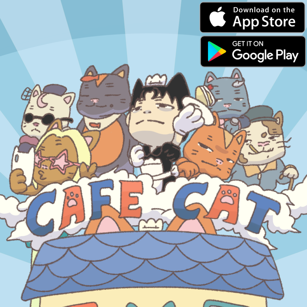
Promo Image
Cat Customer Variations

System Design

Customer States & Attributes

Customers in cafe cat work by following a set of predetermined states that the player must guide them through in order to earn money from them.

The states each customer goes through step by step is:

  1. Queuing – Wait for player assigned table
  2. Walking – Path-find to Table
  3. Deciding – Decides on what to order (Determined by Speed Attribute)
  4. Waving – Waits for player to take order
  5. Ordered – Waits for player to give order
  6. Eating – Eats food (Determined by Speed Attribute)
  7. Leaving – Walks off-screen and despawns

Each of these states lead into the next except for the Leaving State which can be triggered if the player fails to treat a customer within the patience threshold.

Each customer variation also has a variety of stats and attributes that affects their actions during gameplay.

These attributes include:

  • Max Tip – Maximum amount the customer will pay the player
  • Speed – How fast the customer moves
  • Queue Patience – How long the customer will wait in line
  • Wave Patience – How long the customer will wait for their order to be taken
  • Order Patience – How long the the customer will wait for their order
  • Anger Threshold – Determines when the customer looks angry
  • Wave Duration – How long it takes for a customer to order
  • Eat Duration – How long it takes for a customer to eat.

All of these attributes are modified and adjusted to fit a customer’s archetype to help make the gameplay feel unique.

Documentation HereData Here

Payment Algorithm

The payment the player receives from each customer is actually calculated by several different factors to reward player performance and provide a unique experience.

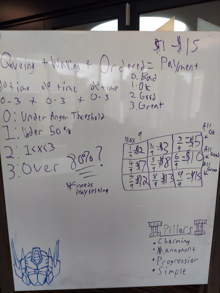
First the player’s service time is rated on a scale from 0 to 3 in all 3 of customer states that require player input. This rating is calculated by comparing the amount of time it takes for the player to treat the customer’s need by the amount of patience the customer has.

Reasoning behind each rating is:

  • 0 – Bad Service
    • Indication is shown that the customer is angry and if they do not get treated soon then they will leave the cafe.
  • 1 – Ok Service
  • 2 – Good Service
  • 3 – Great Service

These 3 ratings are then added together to make the 1 to 9 scale that then determines how much the customer pays the player. This calculation is made by dividing the final score by the max score and then using the percentage and the customer’s max tip to create the final payment value.

Documentation Here

Customer attribute spread across different archetypes
Payment Algorithm laid out on the team's whiteboard

Level Design

Tutorial Design

One of the hardest challenges our team faced was trying to teach the player how to treat customers when they first start the game. We went through many stages of play-testing and iteration to try and make the tutorial as simple as possible.

For starters, we made it so that at the start of each day the player will have only one customer spawn and all customer spawning will be locked until that customer is dealt with. We added a red arrow to help guide the player on what specifically they had to press. (During play-testing a lot of people would tap customers to seat them instead of the table)

Using these methods, we then teach the player all of the customer states. After the player has finished one full cycle, customer spawning is then unlocked.

An important note is that we really did not want text in our tutorial so we could have a wider audience of players and so that younger players could still grasp how the game works.

Difficulty Curve

The difficulty curve for our game is a very fine-tuned system that took several weeks of testing in order to get in a proper state. I lead the charge in trying to make the difficulty curves of each cafe perfect because without a proper difficulty curve, then the game will not feel fun and satisfying from day to day progress.

Due to the way upgrades work in our game I made a couple of major decisions when planning out difficulty and level progression in our game due to how our systems are laid out.

One of the biggest decisions being that the difficulty curve was different for each cafe and progress did not carry over from cafe to cafe. This was done because I wanted player to get familiar with the new layout of each cafe since it would have 1 extra table and a higher spawning rate. Since players can buy a new cafe at any point in the game it makes sense to gauge each difficulty curve on an easier difficulty so players are never thrown straight into a chaotic new cafe.

I also decided that customer pairs were not allowed to spawn on the first two days. Then when the player reaches past this point each day will slowly raise the percentage rate of a pair of customer spawning to help alleviate the amount of chaos at the start. This also helps out with raising the amount of rent on the later days since customer pairs provide way more money to the player.

Documentation HereData Here

Limit Reaching

After a certain number of days are reached, the amount of rent due for the player on each concurrent day is set to a random achievable rent price range.

This is done because after the difficulty is raised higher and higher we hit a rent ceiling that makes it almost impossible for the player to progress. However, we still want the player to keep playing, so we allow the player to play an infinite number of days without ever making the game impossible.

Retry Handicap

When a player ends up not being able to pay their rent they will end up having to retry the day. When a player retries, secretly all of the customer’s overall patience will be increased by a certain percentage to give the player a better chance of success.

This is done to help mediate player frustration. Without it, players may end up having to repeat a day over and over until they eventually quit playing the game.

Upgrade Prices

Upgrade Prices took a bit of time to be set just right. It took me quite a while to figure out what my goal would be for the prices of the upgrades. I eventually decided on the target goal of having all upgrades of a single cafe be unlocked around the 10 day mark.

That way it would make sense for players to want to transition into a new cafe since at that point they would have played the same cafe for almost half an hour. (If the player unlocked every upgrade first that is)

Data Here

Tutorial Stage 1
Tutorial Stage 2
Tutorial Stage 3
Tutorial Stage 4
Cafe 1 Difficulty Data
Cafe 2 Difficulty Data
Cafe 3 Difficulty Data
Cafe Upgrade Prices

UI Design

Rent and Money UI

One of the most integral piece of UI in the game is the UI that displays the amount of money the player has earned that day and how much they need for rent. 

We went through a lot of different iterations on the UI with some having progress bars so the player knew how close they were getting to the rent goal and then we experimented with having the numbers fully displayed with a division symbol to show how much the player need to get to progress.

Eventually we landed on the idea of having it display both the amount of money the player had while also showing the amount of money the player need and then we would use the icon of a little cat bank to showcase when the player reached their rent goal.

This made it rewarding to reach the goal in the game while not making the UI too distracting.

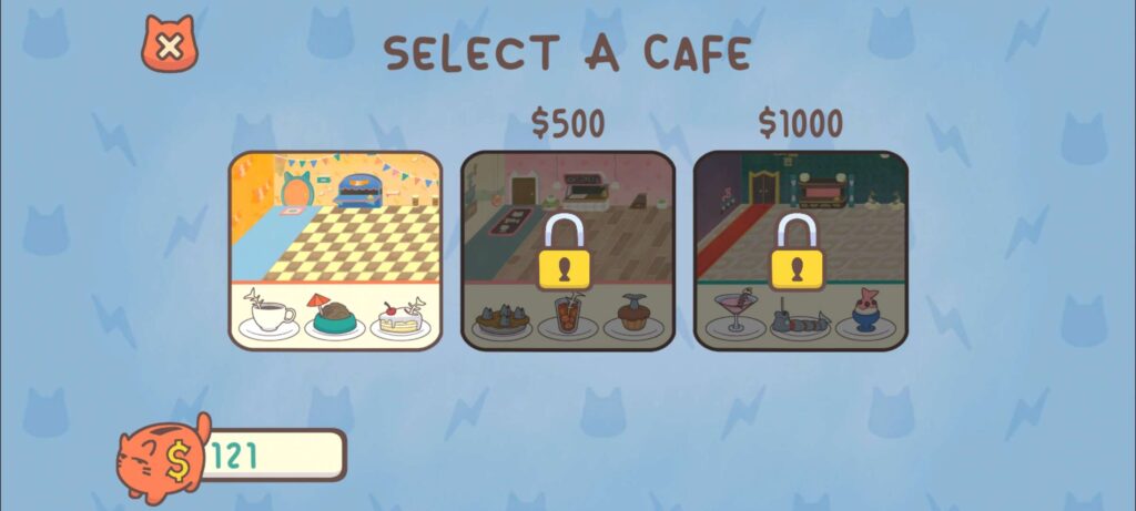
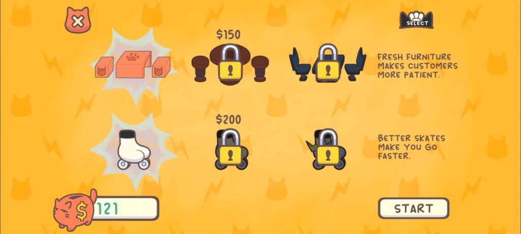
Cafe Selection & Upgrade Shop

The Cafe Selection and Upgrade Shop screens are set up in such a way that the player knows exactly how the upgrades operate between the different cafes and how much total money they need to have in order to buy them.

Our team went back and forth on how this should be displayed with the final decision being that the player would open up a second screen that will only display that specific cafe’s upgrades. If the player wanted to buy upgrades from another cafe they could easily just exit out of the current upgrade shop, select another cafe, and customize the upgrades as they see fit.

This also showed the player the amount of options they had on the ways they could progressed in the game since at the start the locked cafes would have their priced displayed meaning the player would not assume they need all the upgrades in order to buy the next cafe.

Old Rent & Money UI
UI Concept that we came back to
Rent Display normally
Rent Display when goal is reached
Cafe Selection Screen
Upgrade Shop

Post Mortem